Scanner Art!

Format Image

Ok. This project was AWESOME. I had so much fun with this, and I truly feel like I worked super hard on this (more than anything else) because I really felt like I was creating something interesting for people to look at. This project was especially cool and exciting for me since this was my first experience using a real scanner (i’m young ok).

Representational Composition:

This piece truly means a lot to me because of how much thought is behind the entire picture. Something cool I wanted to do was to drive home and collect my most favorite and beloved toys I used to love as a child. I feel like I have always been super creative and into art and music at a young age, and I owe that to the toys that I adored. In this picture, I scanned many things. I scanned, and carefully placed, 4 tamagotchis, my very first film camera that my grandpa gave to me, a gameboy advanced (that I begged my parents to get me for months), my first iPod, various Hit Clips and the Speaker I played them on, also a remote control to a Herbie car (RIP Herbie car that i drove into the fridge and broke), and on top of ALL those items I placed photos from when I was a child over the items and also took pages from an old diary book I had so that it would all create a pretty cool background. This picture is so important to me. I really did put my all into this, and I really am happy with the outcome of this.

elaina  1

Non-representational Composition:

Along with my representational piece, I really enjoyed creating this as well. I bought a deck of playing cards, some dice, two lighters, and chunks of metallic confetti scrambled in the background. This piece, to me, was created to represent that life is sometimes about chance- even though sometimes luck can fuck you over in the long run, I thought that to represent that I would move the cards and items along the scanner to make it look messy- because taking a chance and depending on luck itself is messy! (ayy it all connects)

asdsasadsada


Artist Blog: Wafaa Bilal

Wafaa Bilal is an Iraqi-born artist and an Associate Arts Professor at New York University’s Tisch School of the Arts (MY DREAM SCHOOL I CRY), is known internationally for his on-line performative and interactive works provoking dialogue about international politics and internal dynamics. For his 2007 installation, Domestic Tension, Bilal spent a month in a Chicago gallery with a paintball gun that people could shoot at him over the Internet. The Chicago Tribune called it “one of the sharpest works of political art to be seen in a long time” and named him 2008 Artist of the Year. Bilal’s work is constantly informed by the experience of fleeing his homeland and existing simultaneously in two worlds – his home in the “comfort zone” of the U.S. and his consciousness of the “conflict zone” in Iraq. Using his own body as a medium, Bilal continued to challenge our comfort zone with projects like 3rdi and …and Counting. Bilal’s most recent body of work, Canto III, premiered in a solo booth at the New York Armory Show in 2015 and went on to be shown in the 2015 Venice Biennale.

I like his work because his pieces have a TON of emotional and political emphasis behind what meets the eye. For example his Iraq/Iran, pictured below, seems simple and just pleasant to gaze at, however there is so much meaning behind it which makes the piece interesting and innovative. His website explains, “Iraq/Iran is a text-only green neon sign that constantly switches between spelling “Iraq” and “Iran” in English, rendered in a handwritten fashion. The last letter is the only part of the sign to change, flickering back and forth from “Q” to “N” at a continuous rate. To the viewer’s eye, this transition between letters will be just a blur, and speaks to the simple ways in which societies view and make assumptions about cultures different from their own. The division between the two countries named in Iraq/Iran is here simplified to the difference of just one letter. The transitional act of this flickering character, in its minimal aesthetic, functions as a playful, provocative look at intercultural engagement and assumptions.” I think this is an awesome piece because of how the Q and N are switched to make a statement. iraq-iranhttp://wafaabilal.com/iraqiran/

I think it is also cool how he chose the color green. He explains, “The use of the color green for the neon sign has multiple associations. The color, while significant to both Iranian and Iraqi cultures, for instance, appearing prominently in both countries’ flags, also connotes the idea of openness. This, in association with the neon sign itself, lends an informal, playful air to the piece and places it in dialog with the neon signage of other artists such as Tracey Emin and Bruce Nauman. Finally, the neon sign is a format instantly recognizable to the viewer, and thusly is an object able to be interacted with in a manner that is immediate.” Some people might think its only a color, however to the artist it means So much more and I think this is a huge reason why his art is so cool. It feels like he has a backstory and a reason for why he always does what he does- that makes his art so much more meaningful and extraordinary.

Especially for what is going on in the world right now, especially in America, I think he is one of my favorite artist I have researched so far. For me, being a white Jewish woman in America who is dating a Muslim is powerful, and his art work is something I can strive to relate to and to understand one day. I checked out his other work and REALLY enjoyed it.

Assignment 2: Appropriation

For this project, I had an idea after learning about some of the artists I did blogs about.

I really liked how Matt Siber used logo appropriation and had those flying logos. I thought it was really cool and this project was inspired by him.

What I did was I had my main picture that I wanted to start on- sort of my beginning canvas. The first picture I used was a high quality picture of graffiti I found on the internet. My plan was to layer different logos on top of graffiti. The logos I picked were things that had to do with how we communicate today- mostly the internet. I took 5 logos: the Twitter icon, Kylie Cosmetics icon, Starbucks logo, and an Emoji, and also a picture of a text message and slabbed them on the graffiti wall. I wanted all these logos to be appropriated with graffiti art because I think of communication as art, even though some people might not think so. I believe that sometimes we think of communication as just a way to talk or interact with others, and I believe that is art. I liked this project and what I did was create new layers for each logo, used the clone stamp for some of them, and then used the magic wand tool to select and make it transparent so I could place them wherever I wanted.

Artist Blog: Cory Arcangel

Cory Arcangel is a New York post-conceptual artist who makes work in many different media, including drawing, music, video, performance art, and video game modifications.

He is an internet artist and computer programmer who works with video, installation, music composition, sculpture, print media, and mathematics. In this workshop, families explored digital media in Arcangel’s work and created computer-based work inspired by the artist’s process. Kids and parents made their own desktop icons, using a drawing program to make images of celebrities, self portraits, and abstractions.

url

Ok, so Cory Arcangel is basically amazing. Below is his Raw Youth, 2014, which is Foam pool noodles, wristband, tailored Bravado Justin Bieber Vertical Hoodie, Skullcandy headphones, Apple iPod classic and charger, Apple iPhone 5 case, Skrillex “Scary Monsters And Nice Sprites” MPEG-1 Audio Layer III file. PRETTY FREAKING COOL IF YA ASK ME. ESPECIALLY THE JB HOODIE. raw-youth-2014-046-full-heart-01-database-sm
Below is his famous hand modified hacked Super Mario Brothers cartridge. Characters and backgrounds were erased and replaced with abstract shapes/colors/patterns – an investigation of game aesthetics and human memory.

http://post-data.org/beige/abstract_project.html


Artist Blog: Rashaad Newsome

Rashaad Newsome is a multidisciplinary artist whose work blends several practices together including collage, sculpture, video, music, computer programming and performance, to form an altogether new field. Best known for his visually stunning collages housed in custom frames, Newsomes’ work is deeply invested in how images used in media and popular culture communicate distorted notions of power.

One of my favorite pieces is Cognitive Dissonance (2016) which is a mixed media collage on paper. (photo below)cognitive-dissonance-800x865


He received a BFA in Art History at Tulane University in 2001. In 2004, he received a certificate of study in Digital Post Production from Film/Video Arts Inc. I think his pieces are very innovative because of the way he uses mixed media. It also are images that are very one of a kind and I LOVE his style.

I also really love King of Arms (2015) and it can be seen below:

His website has so many things of his and I really enjoyed scrolling through it and looking at all his art.

http://rashaadnewsome.com/#work/performance/shade-compositions-sfmoma-2012

One Tool project

I had so much fun with this project!

Photo #1:

*Before*

screen-shot-2016-09-13-at-12-39-09-pm


*After*

picture-1

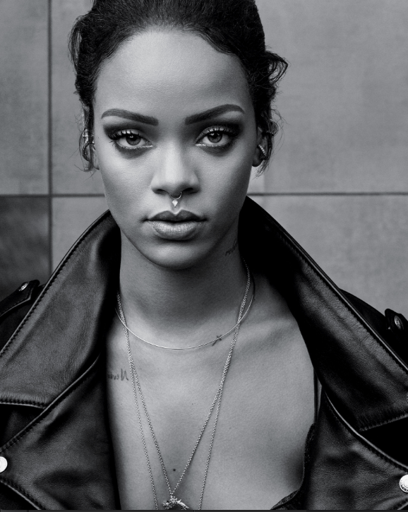
For my first photo, I took a picture of Rihanna I found online and decided I wanted to alter the color of her jacket. The tool I used was the Color Replacement Tool. I picked the color I wanted the jacket to be and then I drew over what I wanted to change. I thought since this was originally a black and white photo that making a pop of color would look super cool. After the Color Replacement Tool I used the Sponge Tool all over the photo to make it a little more darker and to alter the contrast.

Photo #2:

*Before*

screen-shot-2016-09-13-at-12-54-54-pm

screen-shot-2016-09-13-at-12-58-47-pm

*After*

untitled-2

For my second photo, I took a paparazzi photo of Kanye and decided to make a “poster” like picture from it. I took The paparazzi photo and used the Magnetic Lasso Tool to edit all of Kanye solo out of the picture. Using the “PABLO” image, I layered the two images and then I was able to Transform, then Scale the background photo (PABLO) so then the picture now looks like a poster instead of the typically paparazzi photo. This picture took me like half an hour because it was really difficult to learn how to layer and combine basically two images to create one.

Photo #3:

*Before* 

Sugar Factory American Brasserie Grand Opening Hosted By Kylie Jenner

*After* 

untitled-3

untitled-d3


THIS WAS MY FAVORITE I EDITED. LOOK HOW COOL IT IS. Anyways, I used the Clone Stamp to make a funny picture of Kylie. So as you can see I did two pictures using the Clone Stamp because I liked experimenting with the tool. I think these two pictures (especially the second picture) came out SO COOL. I really like how it looks like cartoon-meme like. I think this was the funnest tool to use because I could be super creative and have a vision for what I wanted the picture to turn out and look like.

Artist Blog: Matt Siber

screen-shot-2016-09-11-at-1-43-20-pm


I wanted to include Matt Siber’s bio that I found on his website because I thought it was really cool and spoke a lot about himself and the type of art he works with. I think I can relate to him a lot because I like to distort photography, but I like to create art that has an effect or purpose on popular culture or just every day humanity.

A piece of Siber’s that I thought was really interesting was his Floating Logos project, which aims to draw attention to signage placed atop very tall supports by digitally removing those supports.

Below are two photos from his series:

mcdtruck_t lowes_t

I thought his logo project was pretty unique because I love how he incorporates our everyday American culture into his photography. I liked how it looked as if the logos were floating in the sky and I wonder how he went about editing the poles out.

Another project of his that is pretty awesome is The Idol Structures project that was installed at the DePaul Art Museum in 2015.is_info

According to his website, “Idol Structures focuses on the three-dimensional elements of the systems of advertising in public space while evading or obscuring the two-dimensional messages they carry.” The project often plays between 2D and 3D interactions with the viewer as a means to subvert the commercial 2D messages. This work is driven by a personal resistance or protest against the influence and omnipresence of corporate messaging. This is interesting to me because it has a mix a contemporary art as well as a mix of his personal human expierence mixed in.

I really like Siber’s art because not only does he have a talent for photography, he also has a really good well rounded ability to do all sorts of art. His work is admired around the world, and he could be called the renaissance artist (since he is so well rounded on so many art mediums.)

Artist Blog: Nam June Paik

Known as the man who invented video art, Nam June Paik is an important artist of our time. He truly transformed video into an artist’s medium with his media based art that changed and influenced our understanding of visual culture.

His famous works include, the Electronic Superhighway, TV Garden, Zen for TV, Egg Grows, Megatron/Matrix, and so much more.

When researching about Paik, I had no idea that he was the guy behind all these amazing creations. Last year, I went on a trip to Washington, D.C to see the famous Electronic Superhighway. Little did I know about the man behind it though. I went to the museum to see that very exhibit and I remember staring in front of the massive piece of art for quite some time. The highway was so magnificent and huge, it caught my attention and honestly i could have stood there all day just watching all the little TV’s flutter and change about. The Electronic Superhighway is unlikes anything i’ve ever seen. Paik is so innovative in his works and truly puts all his heart and soul into his video creations.

The way that Paik incorporates televisions into his artwork is what makes him an intense and meaningful artist. I love the way that he intertwines electronic technology to create huge masterpieces. I think the art he created influenced SO many other artists to use TV and media in cultural and other types are art.

Below are some of my favorite works of him:

The Electronic Superhighway 1995:

8eefc9d24cf33bca103752b89e6863d50e75003f

Megatron/Matrix 1995:


Zen for TV 1963/1990:


l_ssujjhnxof

Artist Blog Post: Christian Marclay

ChristianMarclay

As a Swiss American visual artist and composer whose multidisciplinary work encompassed performance, sculpture, and video, Christain Marclay is a profound artist. His art tends to be  thought of as “imaginatively exploring the physical and cultural intersections between sound and image, often through the deconstruction and recontextualization of recorded media and its associated materials.” He explained, “I’ve always been interested in how sound is visualized,” That being said, in 1979 he began exploring sound by manipulating turn tables (old vinyl records), and also explored his interest in a related abstract concept, time, by compiling clips from an enormous range of films into a 24-hour single-channel video titled The Clock (2010). Below you can watch some of the clips from his famous film:


Something cool about The Clock is that Marclay arranged the clips in order of the minute each one marked, and in exhibition the work was synchronized with the actual local time. For its virtuosic composition and its mesmerizing effect on viewers, The Clock was widely celebrated, and its presentation at the Venice Biennale in 2011 earned Marclay the Golden Lion for best artist.

Screen Shot 2016-09-07 at 11.43.26 AM

Above are some of his exhibitions. I really enjoyed looking into Christian’s art because he combines music, film and also photography to create an interesting medium. Most art I feel as if I can not connect with, but after watching some of his film and also learning how he used turntables to create art, i thought it was amazing and extremely innovative. As a musician myself, sometimes it is hard to branch out of the classical box that so many musicians force on you, however Christian jumped out of that box and did his own and expiremented and just enjoyed music- which is something I think some artists don’t do enough. Although Christian gained attention and fame from mostly his films, I enjoy him as an artist for his vision for music. Below is a song I really enjoyed that he “created” or produced.


In 1991, he produced his Body Mix series where he comment on the commodification of popular music, various album covers on which human bodies are displayed are stitched together to form alien or sort of mutated bodies. The influence of Marcel Duchamp was evident in how he hilariously transfigured musical instruments in Lip Lock (2000). In Lip Lock Christian fused the mouthpieces of a tuba and a trumpet. Again, this work of his was said to be influential of Dunchamp. Below is a picture of the altered Tuba from Lip Lock. 

Screen Shot 2016-09-07 at 12.44.32 PM

I thought this was interesting because he seemed to fuse two instruments into one another. I think that this idea of his is very innovative, but simple and exciting at the same time. I love how his art is reflected through music, and musical instruments. It’s so exciting and this tuba seems to look very elegant, even though it could be seen as mutated. As a music major, Lip Lock was very interesting to learn about. I thought this tuba was a really cool piece of art because where the second smaller tuba is was where you were supposed to create music, however because he blocked the mouth piece the combined instrument can not be played. I am curious to understand why he made a piece that can not be played, but only admired. I think that I liked this tube a lot, however I am more moved by how he created music with the turn tables. For me, Lip Lock is interesting to look at and to learn about, but I think that art is about pulling at your inner emotions and to grasp deeper meaning within something. I don’t feel connected to this, but I did feel a deep connection to his alternative musical art.


My First Blog Post

Screen Shot 2016-08-31 at 11.13.48 AM


To me, Digital Art is the creative freedom one has using technology. Digital art is all around- whether it is an ad online, a site, or even a blog; digital art is all around us. I worked at a social media firm in Washington, D.C this summer where I got to be a part of various teams within the firm itself. One team I got to work with was called the “creative thinkers team”. This team’s job was to create eye catching and creative inforgraphics and ads for clients. Before working at this internship I thought that digital art was simply just computer art- however after working with such an impressive team who used artistic programs such as photoshop, illustrator and many more, I learned that digital art is all around us no matter how subtle or sweet.

I find that digital art is so incredibly unique and diverse from other kinds of art because you are using technology to create something that so many diverse pieces or art using the internet and web programs as your drawing board. The desktop is your canvas, and the mouse is your pen. Digital art is a new approach to the way that art is certainly explaining in the 21 century. Throughout the years technology has advanced and has lead us to express ourselves in a whole new dimension. Technology and computers have opened up a new way to express art in our time, and the creative of digital programming allows us to push forward and create things we can’t necessarily produce on paper. I love creating digital art because i’m a techy and a computer gook at heart. I love learning new programs and diving into my work on photoshop. Sometimes digi art can limit art in a way though, since the programs (such as Adobe’s) can be very hard to learn at first. These programs are difficult and take time to fully grasp and learn how to drive. I found that the more you fiddle around and goof around on a specific program, the more you will get to learn it better. Sometimes it can be frustrating to know where all the buttons are to click, or how to bring your photo or art to life due to how much the program is capable of, but always keep trying and strive to drive the programs as best as you can.

I have a unique aesthetic (i like to think). I enjoy cool 80’s style looking photos of interior design, portraits, and also landscaping. By 80’s I tend to go for faded colors and old style looking photos. Below are some of my favorite landscape photos. I am a photographer at heart. I love capturing portraits of my friends and switching things up on photoshop to make the colors pop. I am a Nikon enthusiast and love to go around and snap RAW’s around campus and even on vacation. These photos really speak to my photography style, and the pictures I love to take and admire. My tumblr is Silentlyawake.tumblr.com and that is where I love to look for art and post my photos.

Screen Shot 2016-08-31 at 11.38.47 AM Screen Shot 2016-08-31 at 11.39.51 AM Screen Shot 2016-08-31 at 11.39.34 AM